📊 Visualizing your Data#
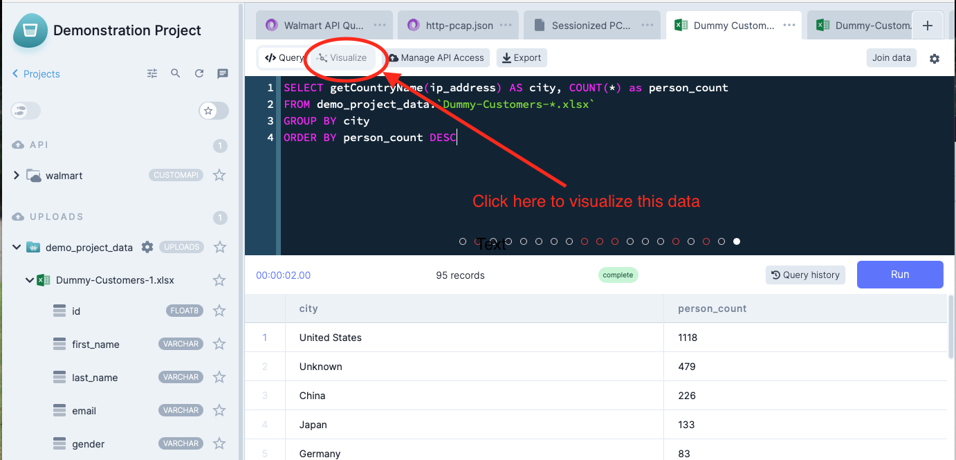
Now that you know how to execute a query in DataDistillr, let's create a visualization. In the query editor, enter the following query:
SELECT getCountryName(ip_address) AS Country, COUNT(*) AS Customer_Count
FROM demo_project_data.`/Dummy-Customers-*.xlsx`
WHERE getCountryName(ip_address) <> 'Unknown'
GROUP BY Country
ORDER BY Customer_Count DESC
This query is an aggregate query and will count the number of records by country name. This pattern of aggregation is useful for summarizing data.
Did You Notice the Asterisk?
One powerful feature of DataDistillr is that it can query directories of files as if they were one big file. The query
above is actually executing over any files in the directory with the naming pattern Dummy-Customers-n.xlsx.
Next, click on the Visualize button at the top of the screen to visualize the data.
Visualization Options#
Next, you will see the visualization screen with options on the left as shown. For a more complete view of DataDistillr's visualization capabilities, see the Visualization section of the documentation.
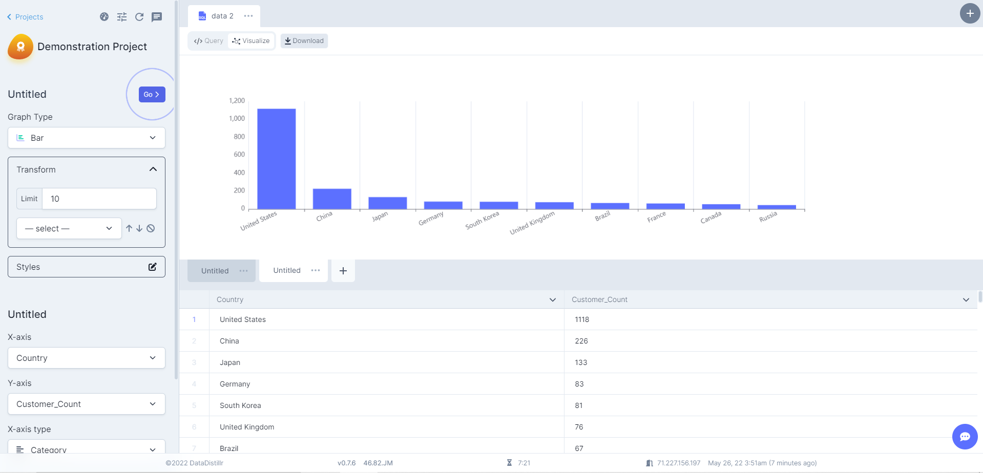
Fill in the left columns with the following options to generate the chart above:
- For Graph Type, select Bar
- Click the edit icon in Transform and set the Limit to 10
- Double-click Untitled to rename the graph and press Save
- For the X-Axis, select
Country - For the Y-Axis, select
Customer_Count
You can export your data visualization as a jpeg or png by hovering over Download in the top bar.
Congratulations! Now you are ready to publish your data.